So.. I thought i would do a bit of an anatomy of a page in the style of Abi. I don't normally go in for double pages but when I have a lot of pictures that just have to be scrapped it can be helpful. Also in a really weird way double pages use up less supplies cos each side has to balance so u don't feel the need to fill up the space as much as on a single. Well..that is my theory anyway! So here it is, my double page.. Quite fitting that we had a dusting of snow today! Ok, The biggest thing I find when creating a double page is trying to make it look like one thing, rather than two seperate pages with similar pictures. By using the same paper and sticking to a limited colour scheme it is clear the pages go together..
The left hand page Quite fitting that we had a dusting of snow today! Ok, The biggest thing I find when creating a double page is trying to make it look like one thing, rather than two seperate pages with similar pictures. By using the same paper and sticking to a limited colour scheme it is clear the pages go together..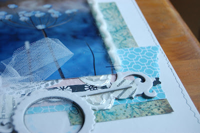 The right hand page
On this layoutI wanted the emphasis on the pictures rather than the fact it was christmas so I used a wintry colour scheme rather than a christmassy one. I also wanted to break away from the traditional slightly, so used baby pink as well. personally when I create a double page, I find that when layering papers what was horizontal on one side works well vertically on the other. For example take the graphic blue paper, on the right it is horizontal but on the left vertical. It makes the pages correspond with each other but still look individual.
Next, I wanted the pages to have similar design elements. In this case it was the trees which I rather like! Lol! They indicate christmas and emphasise the wood in which the photos were taken! (Aslo they were nice and simple!) 

Obviously on the left hand side I used a larger tree because there was more white space. This creates a focal point for the rest of the page and leads the eyes to the trees on the next page. I always like my pages to have something that draws the elements together so that they look connected. Here I used yarn stapled horizontally and vertically which also adds texture. 

Embellishing on this page was kept to certain areas. On the big tree I wanted to give the effect of sumptuious decoration so layered up paper, chipboard and glittered paper. I then wanted to echo this on the right hand page so it look balanced. Therefore I added a line of similar embellishment...

Finally to offeset the graphic title I used my own handwriting to journal...
So there you have it. This is completly subjective, just my thought processes as I make a layout and what I try to do to make it look balanced. How do you think through a page?
Off topic of scrapbooking, look what arrived in the post yesterday...  my upgrade! Yes my new toy was part of the reason there was no post yesterday eeek! You know what is most exciting about it? It can plug into a computer and registers as a mass storage device, so basically u can load any file to it in like 3 seconds!!!!! My gallery is now full of photos and layouts!!! happy times!
my upgrade! Yes my new toy was part of the reason there was no post yesterday eeek! You know what is most exciting about it? It can plug into a computer and registers as a mass storage device, so basically u can load any file to it in like 3 seconds!!!!! My gallery is now full of photos and layouts!!! happy times! Anyway, back to school soon, grrr..
thanks for stopping by!
Loves xxxx


6 comments:
is that an iphone? see my blogpost for an app for the iphone which lets u digiscrap!
looking forward to seeing your next LOs. I love ur design style and the way you describe ur process is really helpful,
have a g8 weekend. we're going snowdrop walking, if it doesn't snow that is,
love Jo xxx
Love the colours you have used, the blue and white gives a real feeling of 'cold' and snow!
Thanks for sharing how you designed your pages.
Wow fantastic page and loved reading about the design process :-) Enjoy your new toy! x
Great colour scheme and love the little touches to draw it all together. I like to make double pages - I often have lots of pics to scrap together, so the double format can be helpful. You're right about horizontal elements on one page looking good as verticals on the mirror page - I like to do that too.
Good page(s) and thanks for sharing the process - it's so much more interesting!
Cute phone.. have fun!
Even your handwriting is beautiful to look at! I really enjoyed reading about your creative process..and looking at the lovely finished layout.
Thanks for this post Abi - I'm always thinking about how to best combine my photos with a writing space, it is not always easy to fit all of it in. Usually I spend all of my time working that out and then I get left with what to add to make it look attractive. It's all an ongoing learning process I think.
Post a Comment