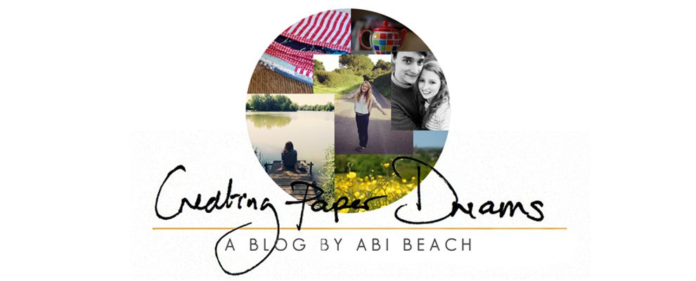
Maybe it's an annual thing but I have been playing around with blog design again. After a year I guess I get bored and I itch (perhaps inadvisedly) to get playing with code again.
Five minutes in and I want to kill both the blogger system and the person who invented code because it just does not make sense to me.
That said the joy and feeling of accomplishment I feel on getting the blog to look like how I want is worth everything.
There are a few new things this time around. First up, "making the ordinary glorious" has gone. That is not to say I am no longer trying to keep this as my mantra but I felt CPD was lacking a real link to me and my name. Both my instagram account and my pinterest page have "abibeach" as the username and I wanted to extend this to my blog header.
I have gone back to a sidebar but I wanted to keep it really simple. There are therefore links to my "tea" posts, tutorials, about page and Project Life. I really like social media icons but just couldn't find a place for them in the blog design therefore there is a new "Connect" page.
I have spruced up both the "About" and the "Tutorials" page. Both were looking a tad out of date. I really liked an idea I had seen a lot which was to include photo links to my favourite posts. I have done this on my "about" page.
Basically the whole blog has gone a lot cleaner and simpler. The boy looked at it and called it "Swedish". I took that to mean minimalist rather than Ikea-esque!
So I would love some opinions. Are there any areas that are difficult to read, not opening or looking funny? Anything else you would like to see? I so value your opinions as long time blog friends.
I will be back tomorrow with a few things I have learnt this time around from redesigning. Mostly to help me remember for this time next year when I am ringing my hands again!


11 comments:
Abi! I love it! I think your make-over is clean and simple and perfect for you. And where you struggle with code, I am completely ignorant on any of that, so I am even more impressed with your design. I'll look forward to hearing a bit more about how you did some of this design work. Well done, you!
Hi Abi, I think you're blog is looking great. I've opened some of the links and they've worked fine. Well done and good job, I don't think I'd attempt what you've done -an awful lot of research would be needed before I could attempt it. Looking forward to your next post and possibly some tips :)
I've only discovered your blog recently so I didn't have the chance to be overly familiar with the old design, but I really love this new look (and I'm a huge fan of your PL layouts !!).
Clean and simple is my favourite :). It looks lovely and fresh, Ali. I am wanting to redo mine so will be reading your experience and tips with interest and hope - I just never seem to find the time :(.
Yes I like your new design a lot. Clean, uncluttered, simple and calm all the things I am aiming for on my blog but it takes ages doesn't it? You have done really well here Abi. I clicked on all your links they all work for me. x
It's definately clean and simple,Abi....and looks great. I wish I had the skill to give mine a makeover!!
Absolutely love it!
Any tips would be appreciated as I was going to ask if you could point us in the direction of where to find out how to even start doing this ... there are a couple of things I'd like to do but I have no idea on where to start ... so, you can interpret that to mean my blog is sparse simply because I do not know how to make it any other way - not that I'd be adding too much!
I'm another fan of the simple, clean design. I have no idea how to deal with code, although my husband can help me on occasion. My lack of knowledge and even more, my lack of confidence, keeps me from even simple changes on my blog.
I think your new look is clean and crisp. Refreshing!
It looks great Abi - you've kept it clean and simple (Swedish?!) and yet bright and interesting. Perfect.
I'm always scared to change too much - a new blog header now and again is about my limit so if you ever fancied doing a step by step tutorial ..... :-)
Can't tell you how much I LOVE your new blog design! I'm another one of those people who finds all that kind of thing scary so I'm totally in awe of your skills! Well done :D
Post a Comment