Weeks there and four of project life...
Photos:
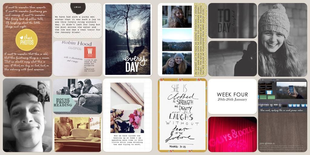
A real mix up over these last two weeks. Week three has the photos the boy and I took on our day trip to a local national trust property. It was a beautiful sunny day and I brought the SLR rather than the iPhone which is always a nice change.
Week four are the back to uni photos which include far more instagrams. We did head out on a quick walk over the weekend though so I included a few of my favourites from that. I loved that big photo of my housemate. It was a toss up about whether I kept it in colour or go black and white. More often than not in Project life the black and white photos stand out more against the colour of the all the journalling and paper.
Journalling:
Week three is quite journalling heavy. I wanted to include my feelings about heading back to uni after Christmas and also document my one little word. Looking back on my album from last year, I am grateful I took the time to record how I felt as well as the events that went on.
Week four has some journalling to go with the screen shot of the boy and I face timing. It is things like this that I want to remember. I hope one day we will laugh at this and find it very "old fashioned" that we video called each other most evenings!
Techniques:
I tried using just one template for both of the pages this week. I love the squares in week three. They are perfect for journalling and for instagrams.
Over the holidays I sat down and worked out some of my favourite ways to display photos and text. I then made up a series of templates to make the process simpler and easier. So far it is working a treat!
I was surprised how much I enjoyed working with the template for week four. I was worried I wouldn't have enough portrait photos to fill it up it's a really versatile template.
Still using tried and tested techniques. Writing directly on photos and adding journalling cards.
Anything else:
I am so glad I just bought a digital scrapbooking kit this year rather than a specific project life one. I can use the elements just how I want them and there is so much possibility for editing and changing them up in photoshop.
This project is great. I'm so glad I have documented January this year. Onto february folks!


11 comments:
Your January really is looking great Abi well done
Your January really is looking great Abi well done
The enlarged photo of your housemate works really well ~ I may have to try that technique!
PS: I just noticed that you've reached 100 followers ~ hooray!
I like splitting photos over a couple of slots - thanks for reminding me of that. I like the proverb too.
Looking good! I too like splitting the big photo up but it looks kinda funny doing it in real life but digital is okay.
Every time you post a Project Life spread, I'm reminded how lovely your black and white photos are, but when I get to doing mine, I seem to forget! I'm another fan of the enlarged and divided photos--another technique I've yet to try. Lovely as always, Abi!
Oh I am always such a fan of your Project Life pages, Abi! You are my inspiration for going digital this year and I am loving it so far.
The photo of your friend is fantastic, and I love that it occupies three spaces. If it's not too much trouble, can you tell me how you get the photo behind all three empty spaces? Do you link the layers together somehow? Or, if you can just tell me what the term is I can Google it to see if I can find an online tutorial.
Also, I wanted to say thanks for the inspiration of quilting with a coordinating thread! I used a dark gray thread when quilting a quilt I made for my new baby niece and I loved the looks of it! You can see it here: http://paperturtle.blogspot.com/2014/01/olivias-quilt.html
Peace and love! :o) xo
I am another fan of your treatment of your lovely housemates photo - and I like the blue semi-transparent circle too. Great to see someone else who captures FaceTime shots!
These have such a winter feel to them. Very cool.
Rinda
Hi Abi, I've been admiring your pages for Jamuary too - makes me wonder if I should've decided on Project Life this year also!
I love the boxy effect of all the pages and the writing onto many of your photos. It all looks uncluttered & unfussy - but very full and interesting.
It's a fab start - only 11 months to go, eh!
Post a Comment