This post was inspired by this
Let's imagine we are sitting down in my kitchen, with the aga's heat spreading around the space and a cup of tea in our hands. If you were there with me I would probably tell you a few things.
I would tell you that I am exploring and experimenting with a whole load of different crafts. Picking up and putting down ideas. Little projects day in day out. I would tell you that I can't settle to a huge project at the moment, that is why my quilt is folded up and half finished in my sewing box. I would tell you that I have picked up my knitting needles again and joyfully cast on in the still of yesterdays evening. I have rejoiced in the comfort of the click and the repetitive action of pulling wool over, round and through, giving my head some space to think.
If we were sitting cradling our tea I would lean in and tell you with a smile on my face that I have had to start another journal because I am churning through them like nobodies business. I would tell you that I am filling them with half formed craft ideas, scribbled down in faint pencil.
I would tell you that I am restless and expectant, ready for the big change that is uni but not quite ready if you get my drift. I would tell you that I get oddly excited about leafing through and filling in all the forms and bits of paper before I head up north. I would tell you that I am nervous and that may be contributing to my inability to settle to anything at the moment. I am expectant for the end of september but still know that it is a while off. I would tell you that I feel like I am in a good place in my heart. That I wouldn't have this expectant, nervous, excitement any other way.
I would tell you that I feel like I am nesting; collecting and creating objects and pictures with which to surround myself in my new university room.
More than anything I would tell you that I am trusting in my God, in his plans and in his timing.
"For God has not given us a spirit of fear, but of power and of love and a sound mind." 2 Timothy 1:7
And then I would offer you cake.....
31 August 2012
29 August 2012
Around here- August edition
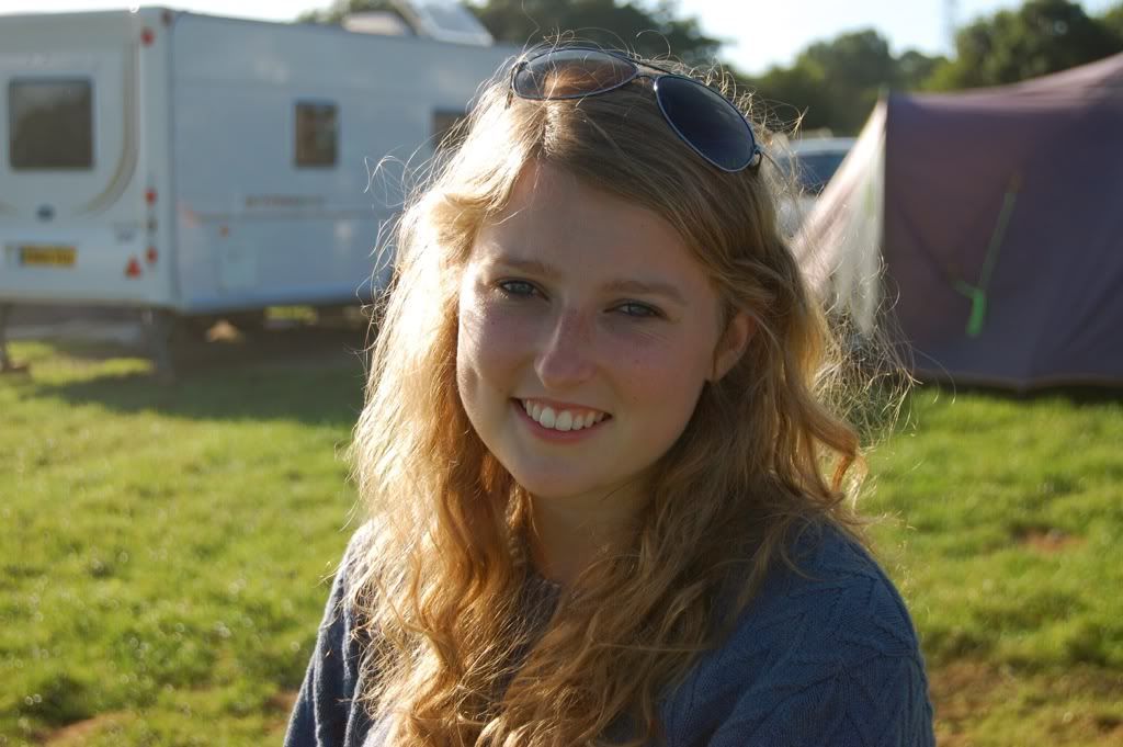
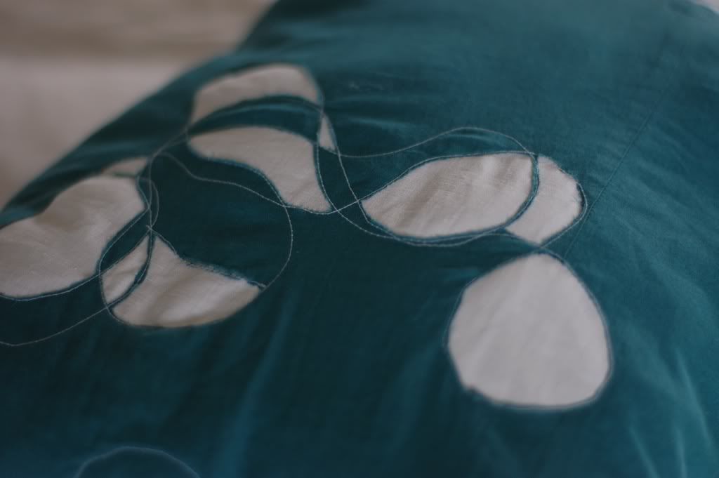
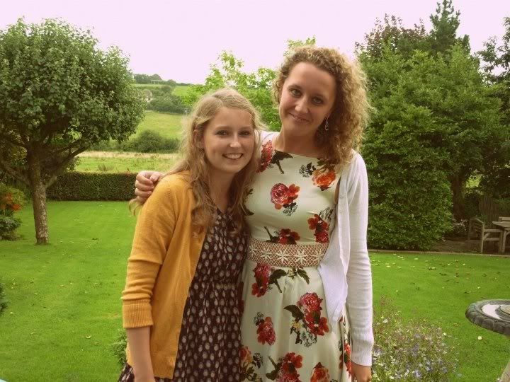
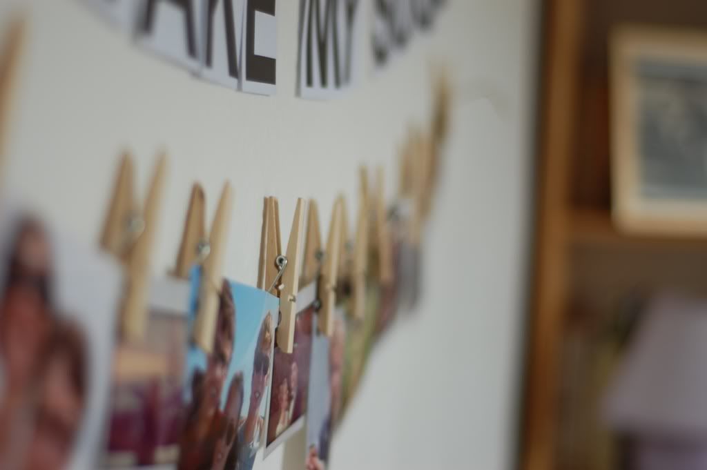
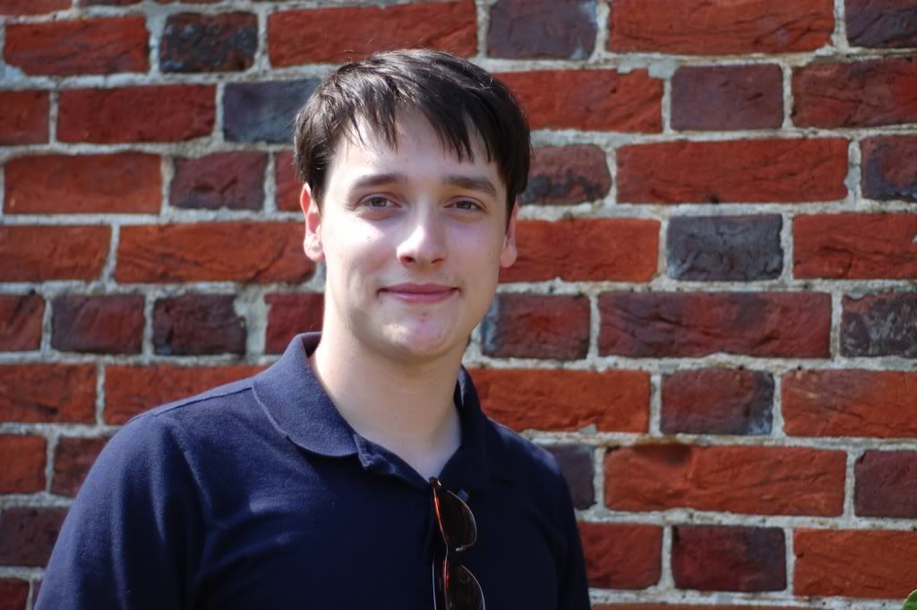
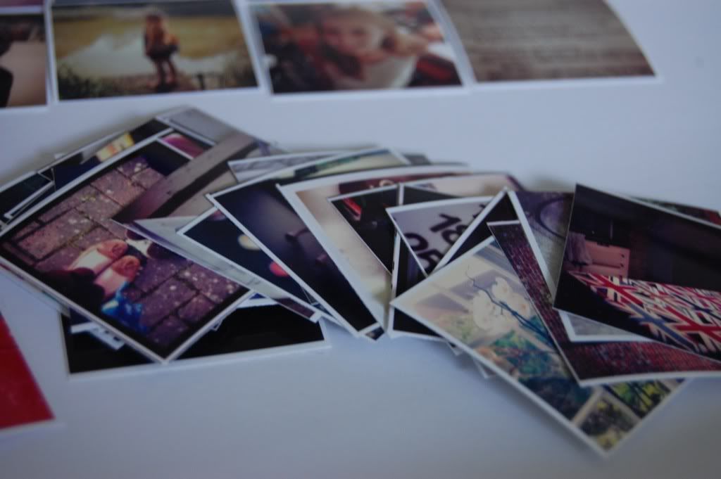
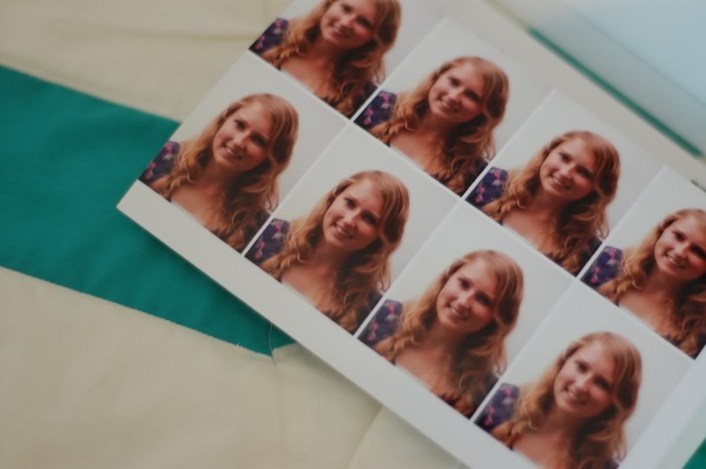
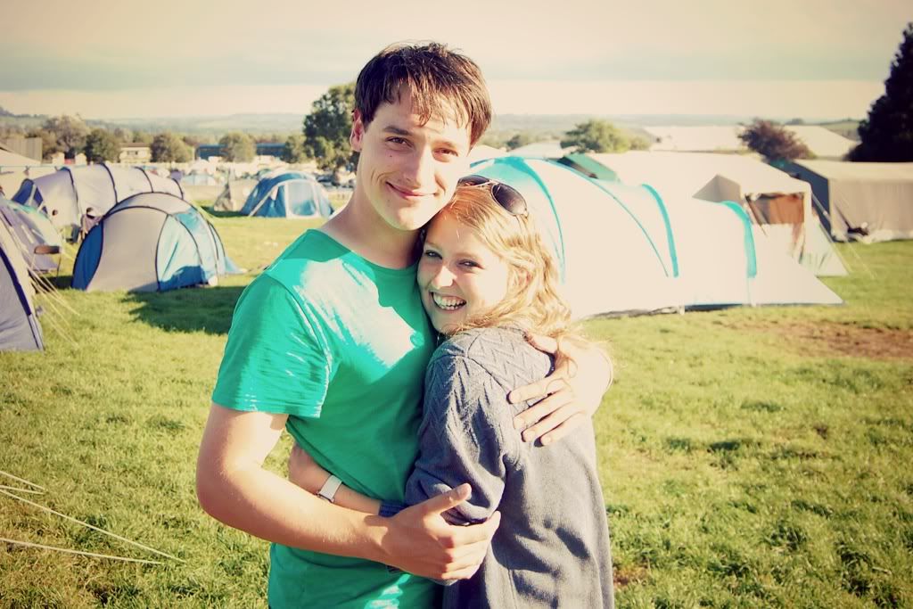
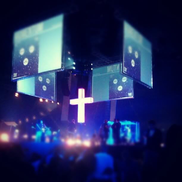
Phew! August has been such a busy and exciting month. It feels only yesterday I was turning over the calendar and now we are moving into September. From top: A whole lot of blogging and redesigning this month, an amazing time camping and worshiping God at Momentum. Doing lots of experiments in reverse appliqué sewing, spending a lovely evening with this lady and a few others. Decorating my bedroom in our new house. Getting this handsome man into some reluctant photo shoots. Playing around with instagram photo displays (tutorial will come!) Sending these snaps off for the next big adventure...uni!
What has your month looked like?
For clarification, around here photos are images I collect together towards the end of the month. The stray images, the orphaned ones. Those left on the end of a memory card or taken for a blog post yet not quite made it on. I think these sum up my month far better than any words can!
28 August 2012
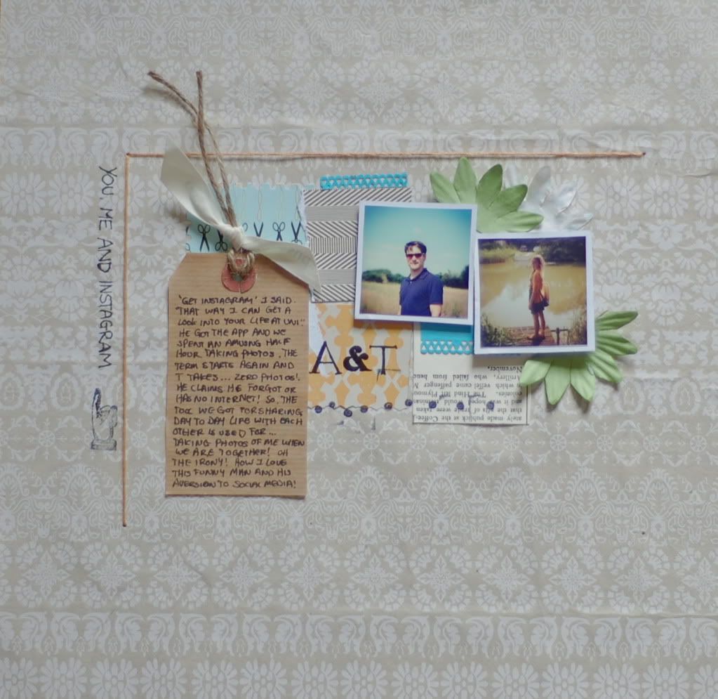
You, me and Instagram
"Get Instagram" I said. "That way I can get a look into your life at uni." He got the app and we spent an amusing half hour taking photos. The term starts again and the boy takes...zero photos! He claims he forgot or had no internet! So the tool we got for sharing each others day to day life is used for...taking photos of me when we are together! Oh the irony! How I love this funny man and his aversion to social media!
I was talking to the boy last night and he also claimed that the reason he doesn't use instagram is because in his words, "you do the photography, you always have done." True.
I think I am fighting a losing battle!
Thank you for all your kind comments regarding my blog design! Not quite ready for designing other peoples yet but who knows, in a few years time!
27 August 2012
Tutorial- reverse applique ampersand
Reverse applique is a technique I found a while back on the design sponge blog. It is very effective and looks much harder than it is!
I had great fun messing about and eventually created a simple ampersand motif. Here's how..
Materials:
Two pieces of fabric, one plain, one patterned. Both roughly A4 sized.
Sewing machine
Sharp scissors
1. Grab your two pieces of fabric and decide which will be the background and which the ampersand. I used the spotty fabric for the background.
2. Print out your ampersand shape and trace it onto the background fabric. (In my case the spotty fabric). To trace simply tape the paper to a window and place the fabric over it. The light makes it easy to draw the design onto the material. I used a white pen so that it showed up on the dark material.
3. Pin your fabric together with the background material on top. In my case the white is under the spotty. Use lots of pins to be sure that your fabric won't move.
4. Set up a contrasting thread (I used white) and sew around the ampersand shape. The two pieces of material will now be joined together.
5. (This is the fun part!) Using your sharp scissors, carefully cut away the TOP layer of the fabric inside the sewn lines. This will leave the coloured fabric underneath exposed. Make sure you don't cut too close to the sewed lines.
6. There are many things you can do with your ampersand now. You could pin it right sides together with another piece of fabric and sew it into a place mat or do what I did, and zig-zag the edges to stop it fraying and then pop it into a frame.
Cute, simple artwork! Have fun!
26 August 2012
I'd like to take you on a tour...
Hey
So the unobservant of you (or those in a reader) may not have noticed, but the blog has undergone some pretty big changes!
I have been dreaming, planning and scheming this for some time. I kept it a bit of a secret though because I wanted you to get the benefit of the end result, not the mess in-between. (oh and there was a LOT of mess!)
Over the years I have been blogging, I have grown more attached to blog design as well as writing post. I think it really is one of my favourite things to play around with. Every now and again the blog gets a bit of a tinker or a tweak. Every once in a while it needs a whole new look.
Each time I redesign I get more adventurous. I have to say though that there were points in this process when I was frazzled. When I was trying to dissect and write pieces of coding which little clue of what I was doing and it was all going horribly wrong! But I had to remember that the blog was only going to be as good as I could make it. If I played safe, I wouldn't be happy. In all the things that went wrong, several turned out right. Some things turned out really well.
My big tip if you are thinking of redesigning a blog yourself is to try everything out on a trial blog. I could tweak and change it as much as I liked and it didn't matter if things got messy or just disappeared into cyberspace! (which they did frequently). Only when I was totally happy did I move my changes over to C.P.D.
My other tip is, don't rush the process. I tried countless changes on my trial blog over the course of several weeks. That said though, I made all the changes to this blog in one day. I sat down and blitzed it!
So after all that waffle, who is up for a tour?
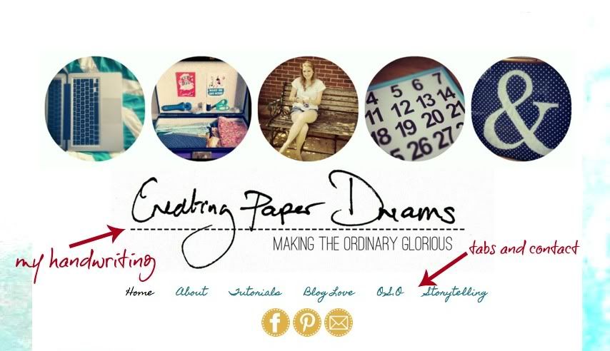
First up, the blog has been given a good dose of Abi! My own handwriting is in the header and at the end of the posts. The background is also my own work-painted and scanned in.
I LOVE a clean design therefore all the useful elements have been moved to the top and all the clutter has gone! The pages and contact details are all in easy reach under the header then we are straight on with the posts. No messing around!
Extra things like archives and followers are right at the bottom of the page. They needed to be on the blog but they aren't the prettiest, so the bottom of the page works well for me!
One of my main aims was to create a user friendly interface. Therefore, simple contact buttons and page tabs. The tutorials page has also been spruced up and arranged into topics for easy browsing.
Finally, big pictures, clean text. I never wanted to lose sight of what the blog is really about!
Feel free to have a play around, what works and what doesn't? I would love to know!
So there we have it! What do you think?!
So the unobservant of you (or those in a reader) may not have noticed, but the blog has undergone some pretty big changes!
Over the years I have been blogging, I have grown more attached to blog design as well as writing post. I think it really is one of my favourite things to play around with. Every now and again the blog gets a bit of a tinker or a tweak. Every once in a while it needs a whole new look.
Each time I redesign I get more adventurous. I have to say though that there were points in this process when I was frazzled. When I was trying to dissect and write pieces of coding which little clue of what I was doing and it was all going horribly wrong! But I had to remember that the blog was only going to be as good as I could make it. If I played safe, I wouldn't be happy. In all the things that went wrong, several turned out right. Some things turned out really well.
My big tip if you are thinking of redesigning a blog yourself is to try everything out on a trial blog. I could tweak and change it as much as I liked and it didn't matter if things got messy or just disappeared into cyberspace! (which they did frequently). Only when I was totally happy did I move my changes over to C.P.D.
My other tip is, don't rush the process. I tried countless changes on my trial blog over the course of several weeks. That said though, I made all the changes to this blog in one day. I sat down and blitzed it!
So after all that waffle, who is up for a tour?
First up, the blog has been given a good dose of Abi! My own handwriting is in the header and at the end of the posts. The background is also my own work-painted and scanned in.
I LOVE a clean design therefore all the useful elements have been moved to the top and all the clutter has gone! The pages and contact details are all in easy reach under the header then we are straight on with the posts. No messing around!
Extra things like archives and followers are right at the bottom of the page. They needed to be on the blog but they aren't the prettiest, so the bottom of the page works well for me!
One of my main aims was to create a user friendly interface. Therefore, simple contact buttons and page tabs. The tutorials page has also been spruced up and arranged into topics for easy browsing.
Finally, big pictures, clean text. I never wanted to lose sight of what the blog is really about!
Feel free to have a play around, what works and what doesn't? I would love to know!
So there we have it! What do you think?!
25 August 2012
Inspired by Stitching on Paper
Over the last few weeks the lovely and charming Clair has provided a free course on her blog called Stitching on Paper. Not only have there been some great ideas but also a whole heap of inspiration from guest designers.
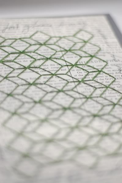
I was suitably inspired. I love hand embroidery and have also been captured by the recent trend of geometric pattern. I decided to combine the two.
I searched some cool patterns on pinterest and decided to try a cubic shape.
Well, let me tell you, on pinterest it looks really easy. In reality... I got through so many pieces of squared paper trying to work it out!
One totally frazzled brain later I have it just about figured. I covered some cardstock in book paper and punched my holes.
I then chose a lovely green thread and got cracking with the sewing. It was very therapeutic, sitting by the window, pushing the needle in and out of the stiff paper.
The design came together well but I felt it needed something a bit more. Using pinterest again, I found a quote that I had pinned a few weeks ago.
"At first glance it may appear too hard. Look again. Always look again."
It seemed to sum up the complicated geometric shape well, and echo the process I went through when creating it. As well as being a good phrase in every day life.
I scrawled it around the edge of my embroidery and then backed it onto grey card.
The finished piece sits in my Bible as a constant reminder to look again when things appear tough.
Thank you Clair for some great inspiration and a fun little course!
23 August 2012
Welcome to my workspace
Hi
I thought it would be fun today to share a little of my workspace. Having just moved house, I have finally got my desk in a state to photograph it and give you tour. Do please step in to my room...
My workspace isn't huge but I am not a big person so it works for me!
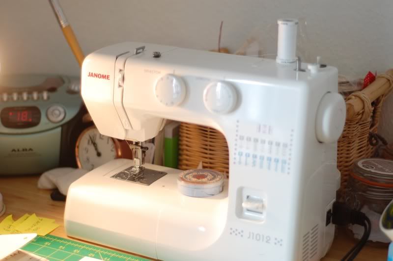
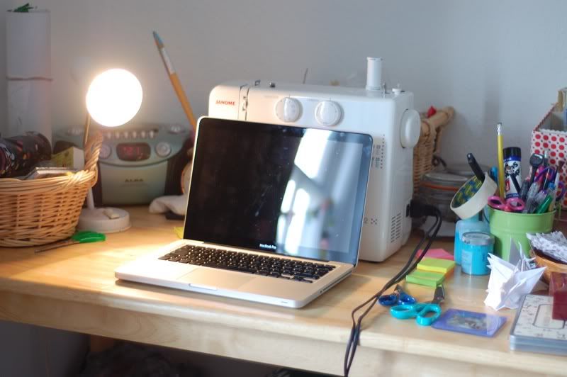
My desk itself is a simple kitchen table from John Lewis. It is pretty big which means that my sewing machine can take a permeant residence. I used to move it off and on but it was a lot of hassle so now when not in use it just slides to the back of the table.
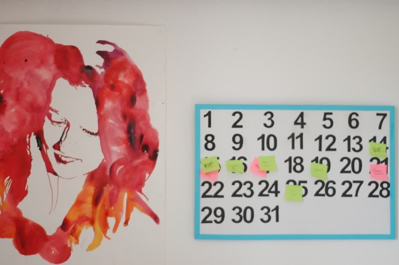
My desk is also my main hub for blogging. I set my laptop up and plan my posts on the board behind the desk. Tutorial here.
Behind the desk is also a painting a very talented friend of mine did for me. It was for her A level art and she asked me to pose and then created this. Kindly she gave it to me when we left school. I love having something artistic but also personal in the space that I create.
My cutting mat is another permanent feature and next to it are my most used items; post-its, scissors and pens.
I keep little embellishments, buttons and small paint tubes in jars. I think they look prettier than boxes!
I also store my knitting needles in a jar. I first paired them up with coloured hair bands which makes finding the right size easy!
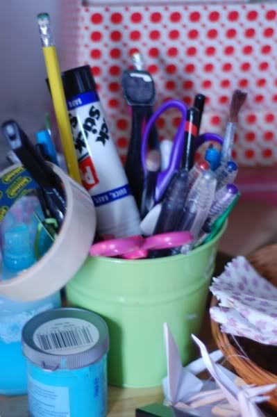
All my other pens and stationary are stored in this little green bucket that I picked up from hobby craft.
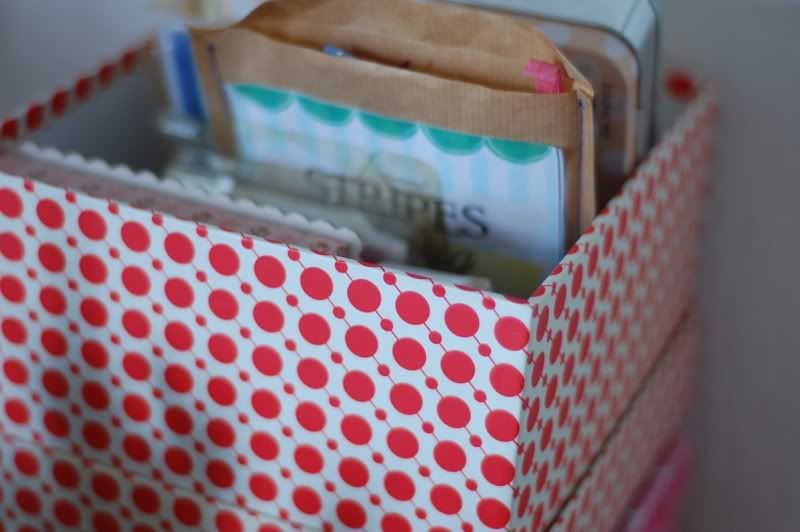
The rest of my embellishments and stamps are stored in this pretty box and basket that sit to the right and left of the desk. They are easy to reach and hold quite a lot of stuff!
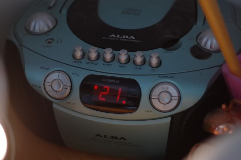
At the back of the desk is hidden away my CD player. Harry potter may be by guilty secret!
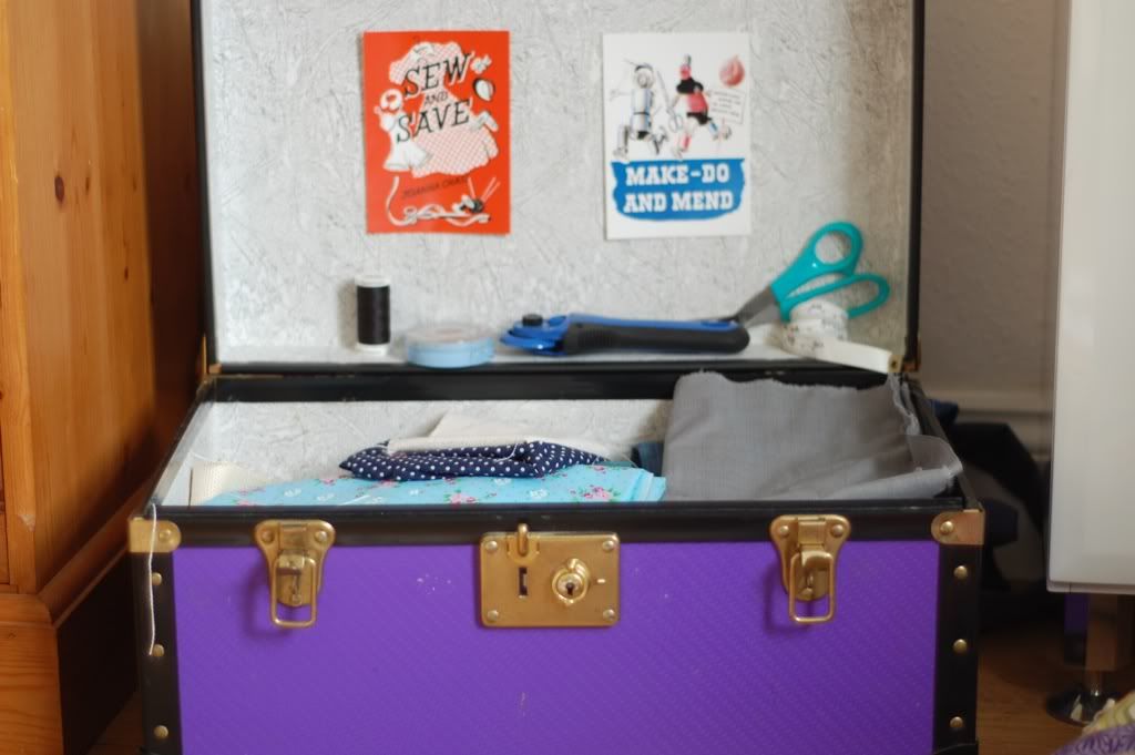
Near my desk is an old tuck box filled with larger fabric scraps. I love to have my fabric on display as it is a source of inspiration. The lid of the box also displays some fun postcards and stores my cutting shears, pins and tape measure.
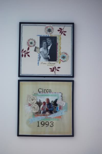
One the wall by my desk are two framed Layouts. I found these 12x12 frames in Urban outfitters and they work really well for LO's.
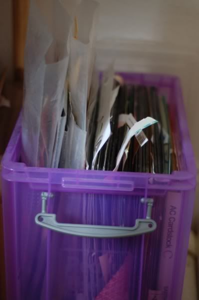
Underneath my desk are plastic storage boxes filled with card stock and patterned paper. (not very pretty but highly practical).
So there we have it! My workspace isn't huge but it functions pretty well as long as everything is in the right place! (which is rare!)
What is your workspace like?
I thought it would be fun today to share a little of my workspace. Having just moved house, I have finally got my desk in a state to photograph it and give you tour. Do please step in to my room...
My workspace isn't huge but I am not a big person so it works for me!
My desk itself is a simple kitchen table from John Lewis. It is pretty big which means that my sewing machine can take a permeant residence. I used to move it off and on but it was a lot of hassle so now when not in use it just slides to the back of the table.
My desk is also my main hub for blogging. I set my laptop up and plan my posts on the board behind the desk. Tutorial here.
Behind the desk is also a painting a very talented friend of mine did for me. It was for her A level art and she asked me to pose and then created this. Kindly she gave it to me when we left school. I love having something artistic but also personal in the space that I create.
My cutting mat is another permanent feature and next to it are my most used items; post-its, scissors and pens.
I keep little embellishments, buttons and small paint tubes in jars. I think they look prettier than boxes!
I also store my knitting needles in a jar. I first paired them up with coloured hair bands which makes finding the right size easy!
All my other pens and stationary are stored in this little green bucket that I picked up from hobby craft.
The rest of my embellishments and stamps are stored in this pretty box and basket that sit to the right and left of the desk. They are easy to reach and hold quite a lot of stuff!
At the back of the desk is hidden away my CD player. Harry potter may be by guilty secret!
One the wall by my desk are two framed Layouts. I found these 12x12 frames in Urban outfitters and they work really well for LO's.
Underneath my desk are plastic storage boxes filled with card stock and patterned paper. (not very pretty but highly practical).
So there we have it! My workspace isn't huge but it functions pretty well as long as everything is in the right place! (which is rare!)
What is your workspace like?
22 August 2012
Camping in numbers
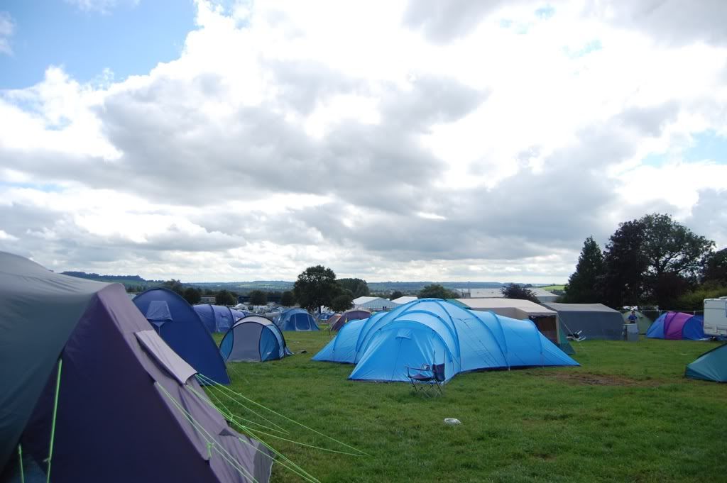
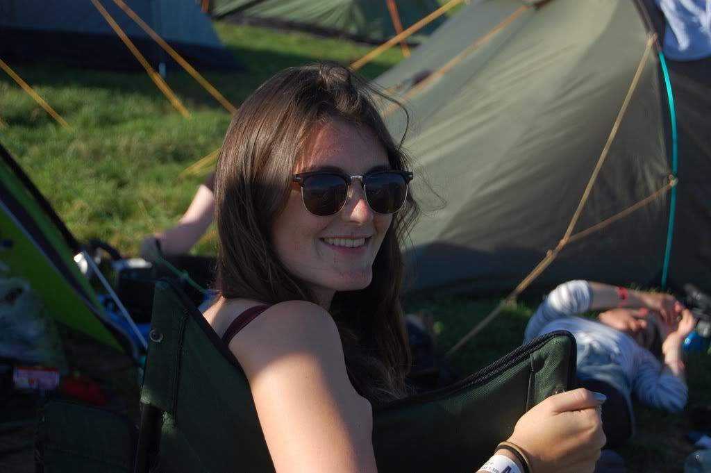
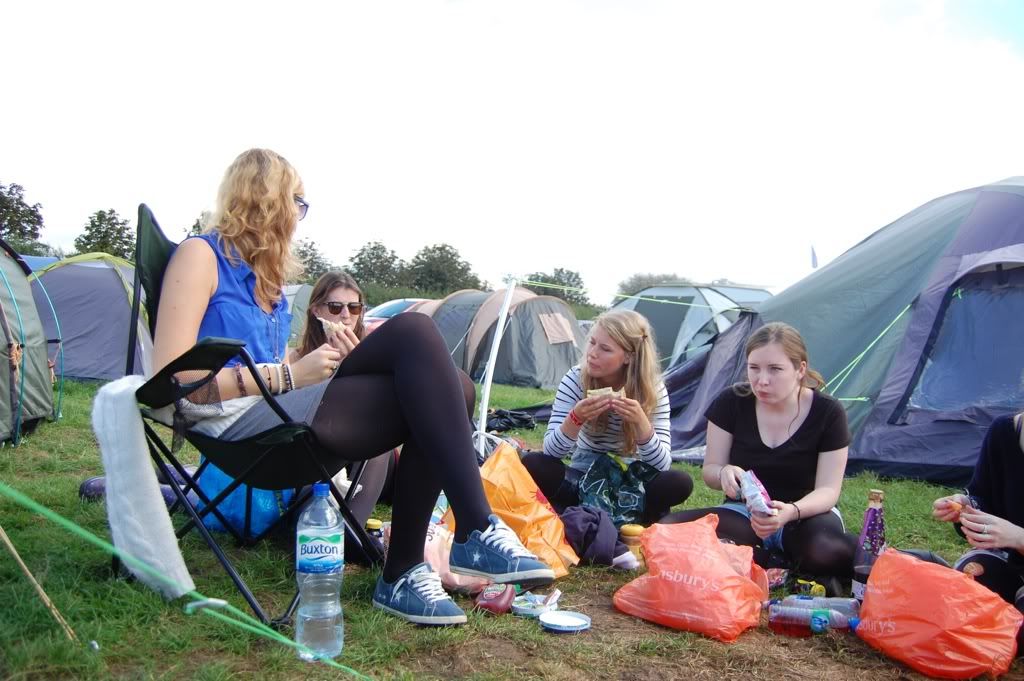
5 days of camping at the Shepton Mallett show ground
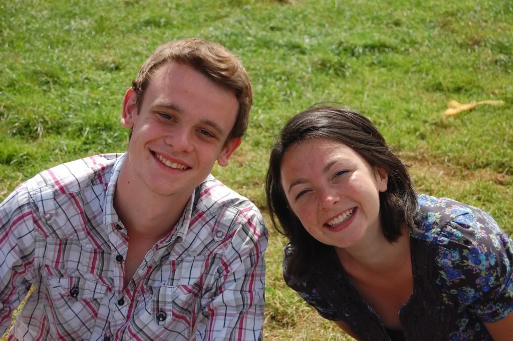
10 or so old school friends who made the week incredible.
20 muddy (ish) shoes and wellies
1 wristband each
4.5 days of sunshine, blue skies and high temperatures
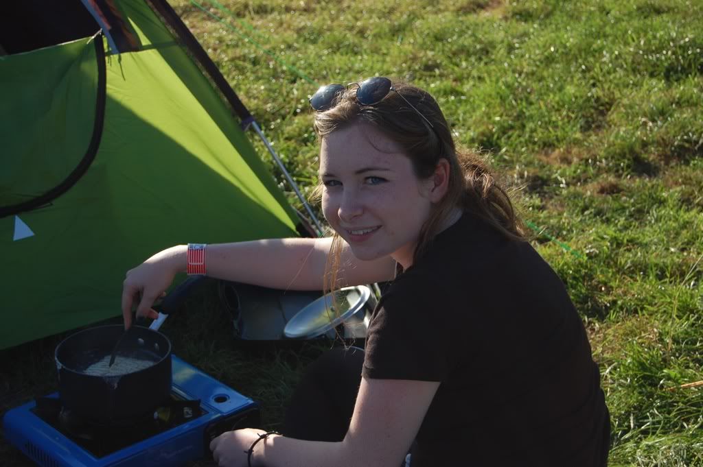
3 packets of pasta cooked
2 camp stoves
7 sausages fried
3 boys who didmost all of the cooking.
1 film camera
hundreds of shots
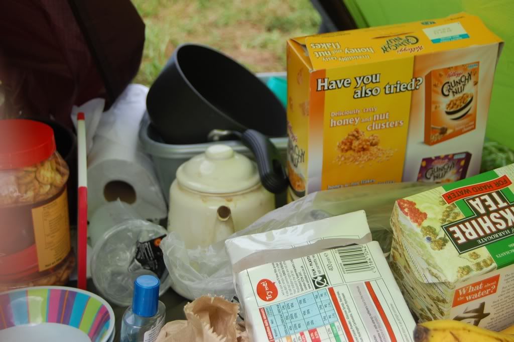
A whole lot of snacks
1 camping chair (we sort of failed on the chair front!)
1 boy wearing the tent
3 boys who decided that women putting up a tent was a bad idea (we didn't challenge this)
lots of hugs and plenty of laughter
1 GOD.
Momentum 2012, a whole lot of laughter, fun and praise!
My week has been busy, how has yours been?
10 or so old school friends who made the week incredible.
20 muddy (ish) shoes and wellies
1 wristband each
4.5 days of sunshine, blue skies and high temperatures
3 packets of pasta cooked
2 camp stoves
7 sausages fried
3 boys who did
1 film camera
hundreds of shots
A whole lot of snacks
1 camping chair (we sort of failed on the chair front!)
1 boy wearing the tent
3 boys who decided that women putting up a tent was a bad idea (we didn't challenge this)
lots of hugs and plenty of laughter
1 GOD.
Momentum 2012, a whole lot of laughter, fun and praise!
My week has been busy, how has yours been?
