So the unobservant of you (or those in a reader) may not have noticed, but the blog has undergone some pretty big changes!
Over the years I have been blogging, I have grown more attached to blog design as well as writing post. I think it really is one of my favourite things to play around with. Every now and again the blog gets a bit of a tinker or a tweak. Every once in a while it needs a whole new look.
Each time I redesign I get more adventurous. I have to say though that there were points in this process when I was frazzled. When I was trying to dissect and write pieces of coding which little clue of what I was doing and it was all going horribly wrong! But I had to remember that the blog was only going to be as good as I could make it. If I played safe, I wouldn't be happy. In all the things that went wrong, several turned out right. Some things turned out really well.
My big tip if you are thinking of redesigning a blog yourself is to try everything out on a trial blog. I could tweak and change it as much as I liked and it didn't matter if things got messy or just disappeared into cyberspace! (which they did frequently). Only when I was totally happy did I move my changes over to C.P.D.
My other tip is, don't rush the process. I tried countless changes on my trial blog over the course of several weeks. That said though, I made all the changes to this blog in one day. I sat down and blitzed it!
So after all that waffle, who is up for a tour?
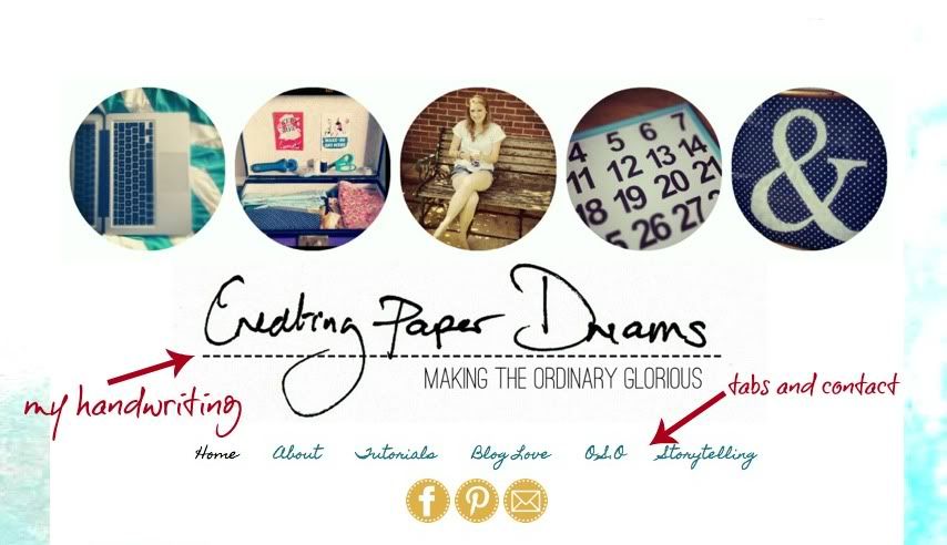
First up, the blog has been given a good dose of Abi! My own handwriting is in the header and at the end of the posts. The background is also my own work-painted and scanned in.
I LOVE a clean design therefore all the useful elements have been moved to the top and all the clutter has gone! The pages and contact details are all in easy reach under the header then we are straight on with the posts. No messing around!
Extra things like archives and followers are right at the bottom of the page. They needed to be on the blog but they aren't the prettiest, so the bottom of the page works well for me!
One of my main aims was to create a user friendly interface. Therefore, simple contact buttons and page tabs. The tutorials page has also been spruced up and arranged into topics for easy browsing.
Finally, big pictures, clean text. I never wanted to lose sight of what the blog is really about!
Feel free to have a play around, what works and what doesn't? I would love to know!
So there we have it! What do you think?!


12 comments:
Looks great Abi. I hadn't thought about creating a sample blog to play on - but what a clever idea!
looks great, love how you used your own handwriting and clever idea to but the archive at the bottom
Great job Abi! Do you want to come out to California and redo my blog?
Blog design is something that feels very out of my comfort zone.
Rinda
I love how this turned out!! I need to redesign mine now!
Loving the feel of your new design, feels very personal
Abi, it's wonderful! I love how the pictures display (getting the pictures to show big enough on my blog is always a trial) and the whole scheme and tone is inspiring and calm and personal. I love it!
If you ever go into blog design, I would like to sign up as your first customer :D
Beautiful Abi! I am a Google Reader user so I don't notice how lovely your blog design is, but I had to click over when I read about the changes.
It's just so clean and simple, and I love the use of your own handwriting :D
It looks glorious, Abi! I love the changes esp the spash background and your handwriting. It does feel very clean and I would have honestly never thought of putting followers at the bottom! Awesome. Like some others, you just let me know if you want to have a little blog design business. I am planning on redoing in the next month and will be paying someone and it's not too late to change who that someone is ;)
Well, I've always loved your blog (at least since I found it) but it's always lovely to have a little surprise when you visit somewhere familiar. The new design is beautiful - and how lovely to have a little bit of your handwriting up there. Just the right personal touch!
I think it's fantastic! and I'm full of admiration for someone who can do it all by herself too
i love ur new look and am requesting a tutorial on how to do it please xxxx
Jo x
I'll try and sort one out for you Jo! Look out in the next few weeks! xx
Post a Comment